Cintix
CINEMA TICKETING HUB / ADOBE XD
00 / PROJECT OVERVIEW
DETAILS
This project was done as part of the Google UX Design Course. Cintix aims to provide a cinema ticketing system for expats whose first language is not English. This app was created to deliver important information about accessibility features in cinemas, comparing ticket prices, buying tickets, and finding nearby venues without having to research multiple websites.
CHALLENGE
I had 2 weeks to focus on competitive audits, creating user personas, mapping user journeys, and creating high fidelity prototypes. My goal was to implement accessibility features and create the fastest buying experience.
GOAL
My goal was to design an app which will encourage expats to explore their surroundings and improve their English skills though going to the cinema.
SPECIFICATIONS
Duration: 2 weeks
Tools: Adobe XD, Google Forms
01 / EMPATHISE
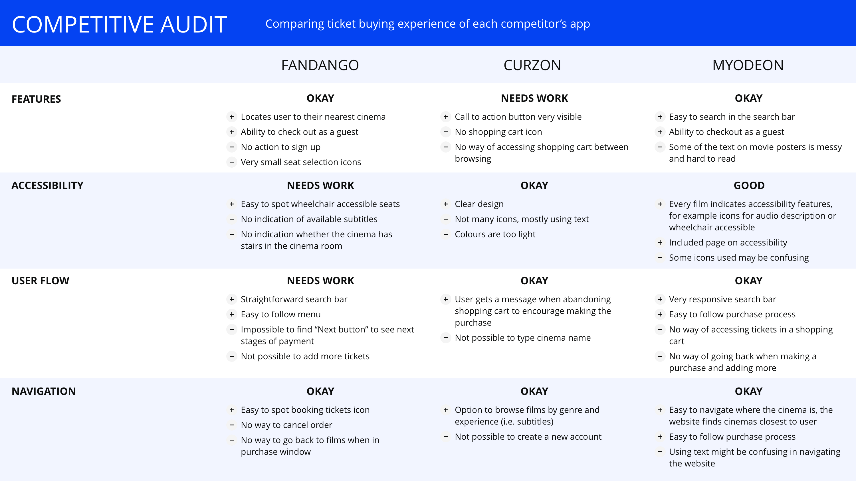
COMPETITIVE ANALYSIS
I wanted to empathise with expats in the UK and understand their behaviour when going to the cinema and acclimatising in a foreign country. I created a participant survey and 7/10 of responses stated that they did not go to the cinema because they could not find films with subtitles and the cinema showing times were not convenient for them. I conducted a competitive research audit on websites and apps that offer a similar service to compare the ticket buying experience.
02 / DEFINE AND IDEATE
IDENTIFYING USER PERSONAS
I have grouped similar responses in the participant survey and created 2 unique user personas. I based my decision to pick the two based on the needs I have identified and on what the users might feel and do.
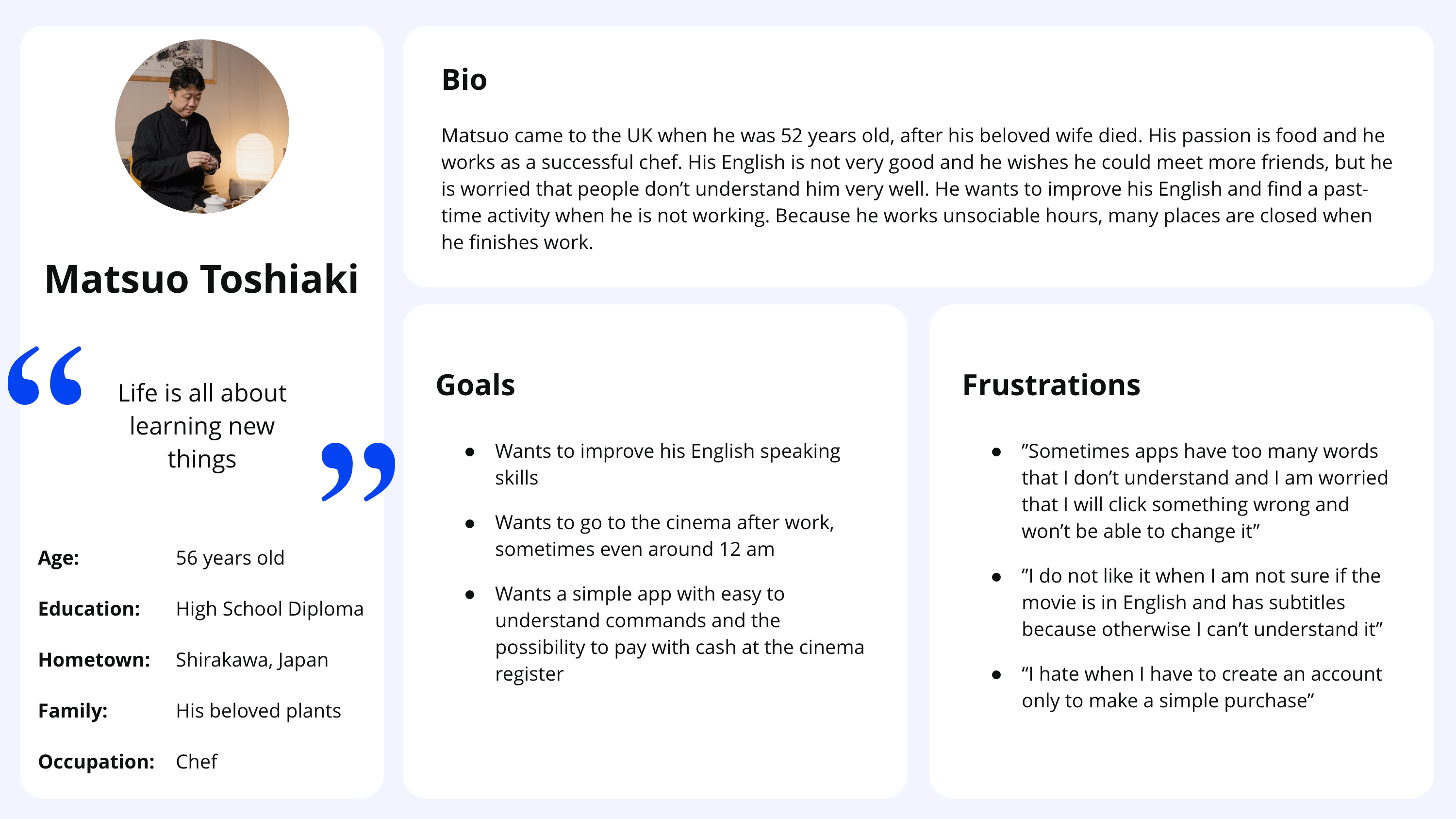
Matsuo, an acclaimed chef who came to the UK when he was 58 years old. He wants to go to the cinema, but he is new to the UK and does not know many places. He works very late hours, so he only has time to go to the cinema at night and early mornings.
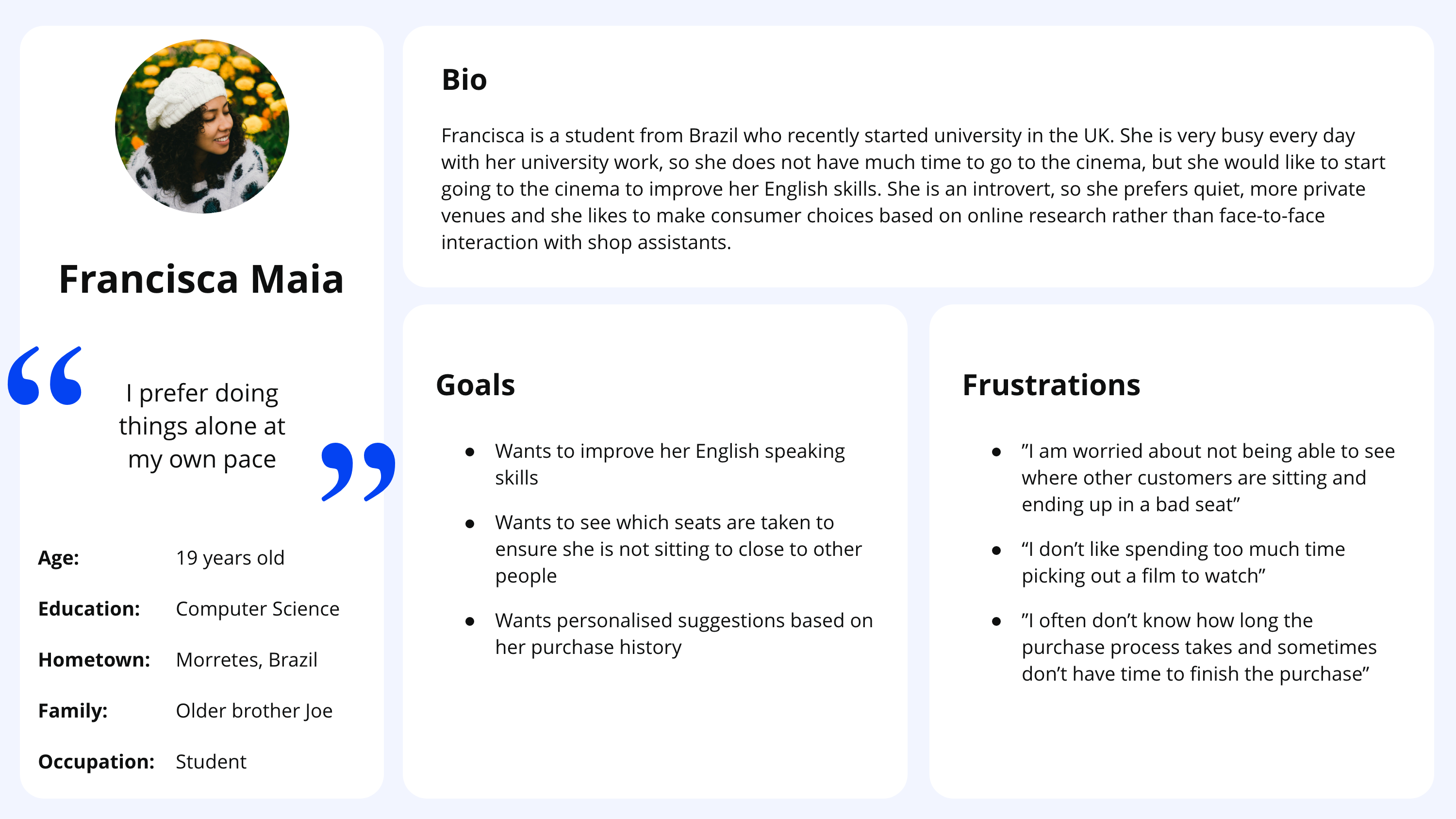
Francisca, a Computer Science student at university who recently moved to the UK from Brazil. She prefers quiet, more private venues and does not feel confident speaking in public spaces. She would like to improve her English skills through watching films.
HOW MIGHT WE STATEMENTS
Before starting any design work, I listed some questions about how to incorporate features important to our users using How Might We statements.
- How might we help Matsuo explore his surroundings and find nearby venues?
- How might we make sure that Matsuo is able to attend film showings at suitable times for him?
- How might we ensure that Francisca avoids crowded cinemas?
- How might we ensure that Francisca can find her way to a film showing without having to speak in public?
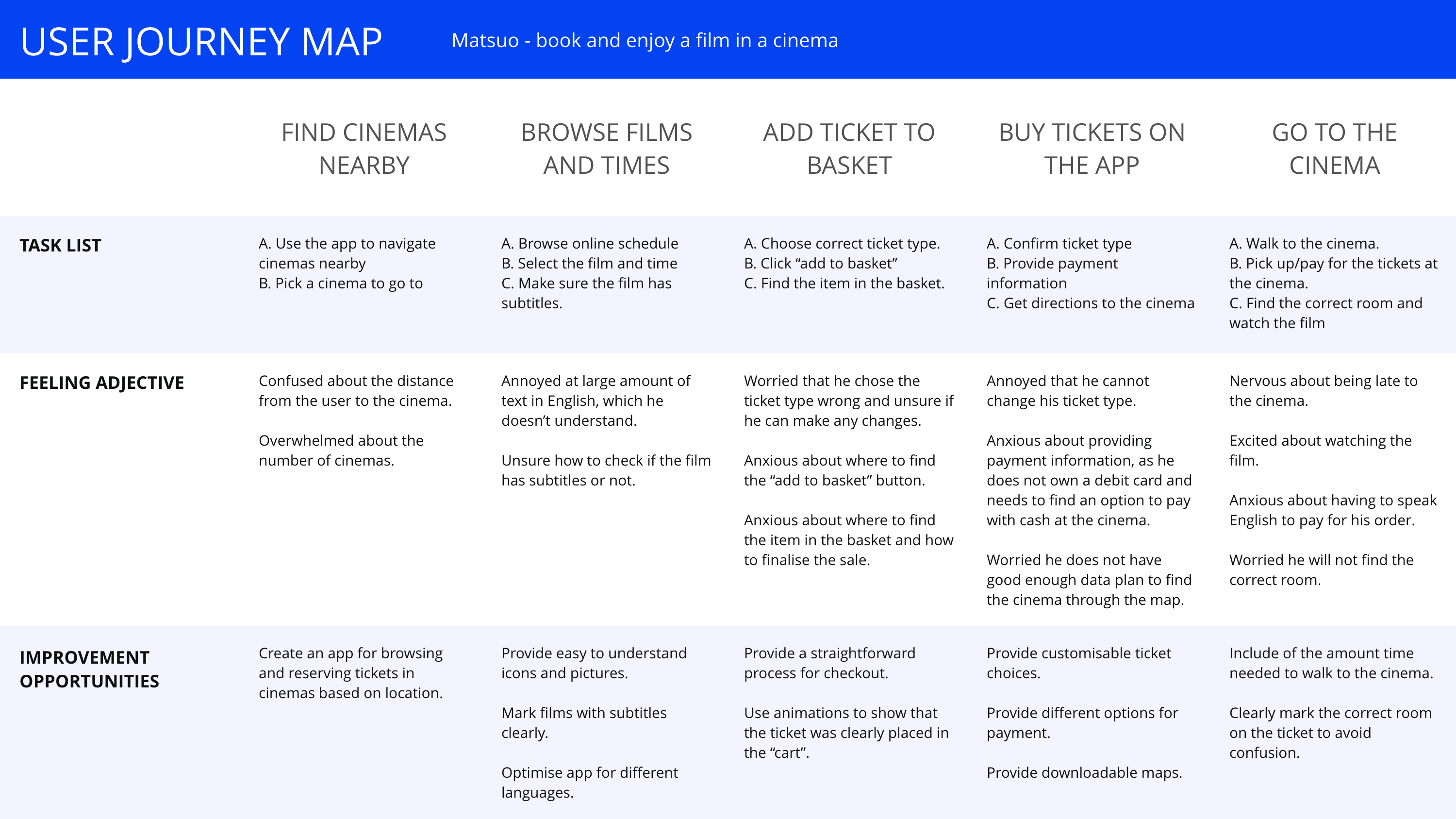
USER JOURNEY MAPPING
I have taken the time to map out behaviours and journeys that Matsuo and Francisca could take with the goal of booking and enjoying a film in a cinema.
Actions that I have mapped out were:
- Find cinemas nearby online and choose one
- Browse films and screening hours
- Add ticket to basket
- Buy tickets on the app
- Go to the cinema
MINIMUM VIABLE PRODUCT
After establishing the research and combining the findings, my aim was to find out what the MVP (Minimum Viable Product) of this project would be, based on the users’ needs. I identified a few key features which would hold importance for users like Matsuo and Francisca.
Key features:
- Find cinemas nearby
- Explore surroundings in a safe and calm environment
- Easily book tickets online
- Pick times and seats based on preference
- Find films with subtitles for language learning
03 / DEVELOP
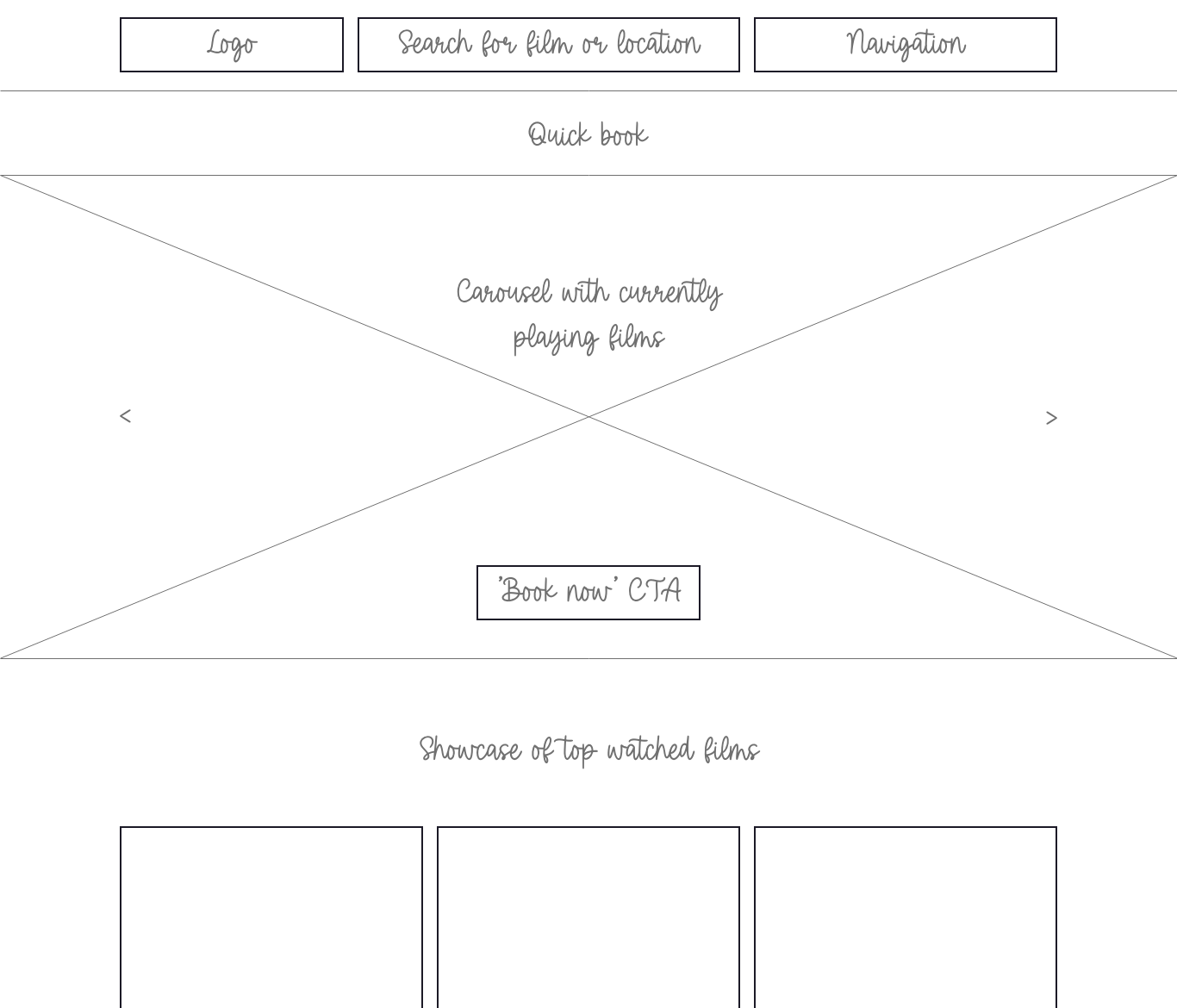
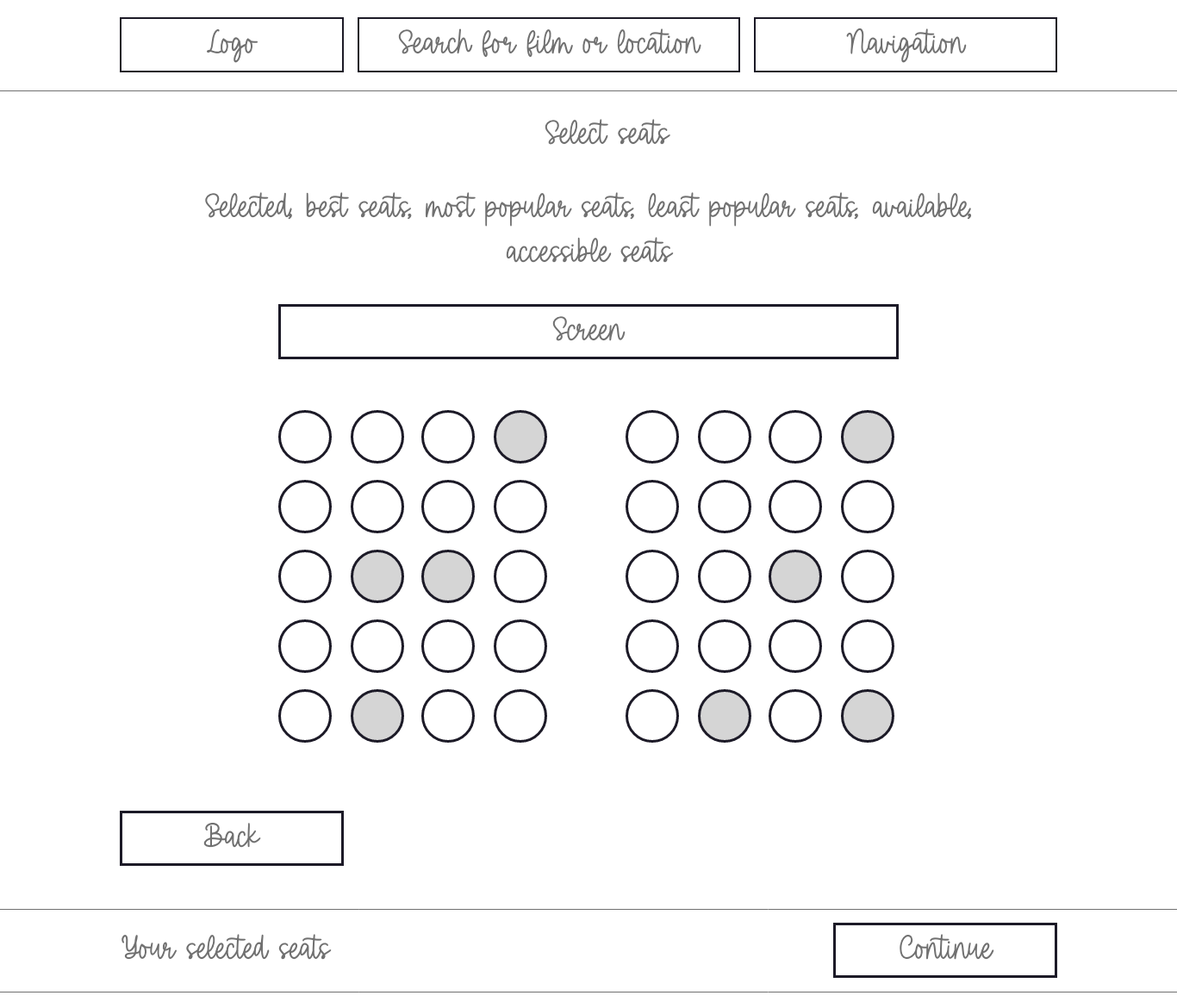
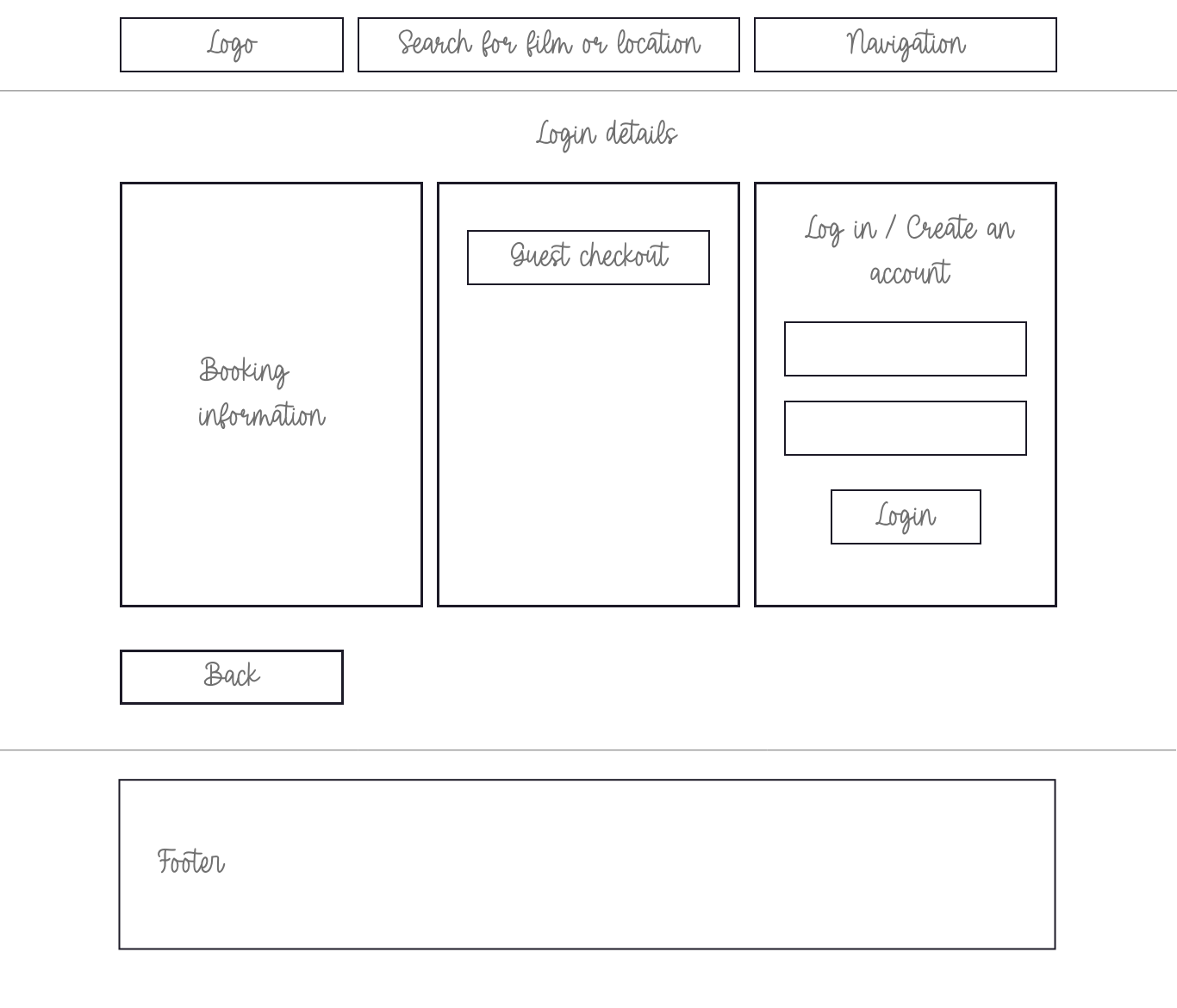
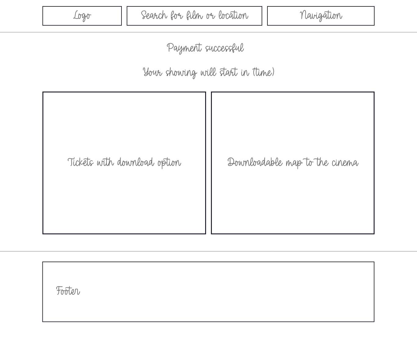
LOW-FIDELITY WIREFRAMES
During the next 1 week I have made low-fidelity wireframes to outline all the necessary features.
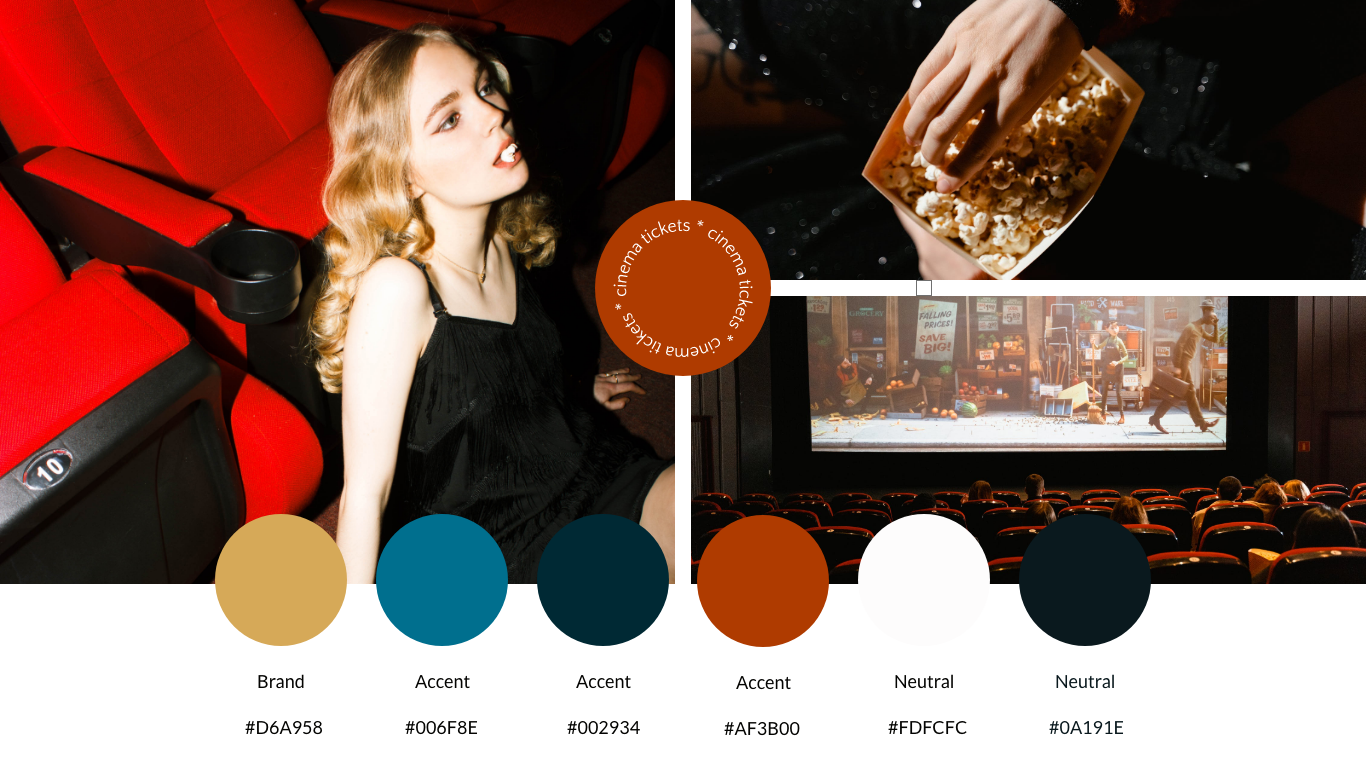
CREATING THE BRAND KIT
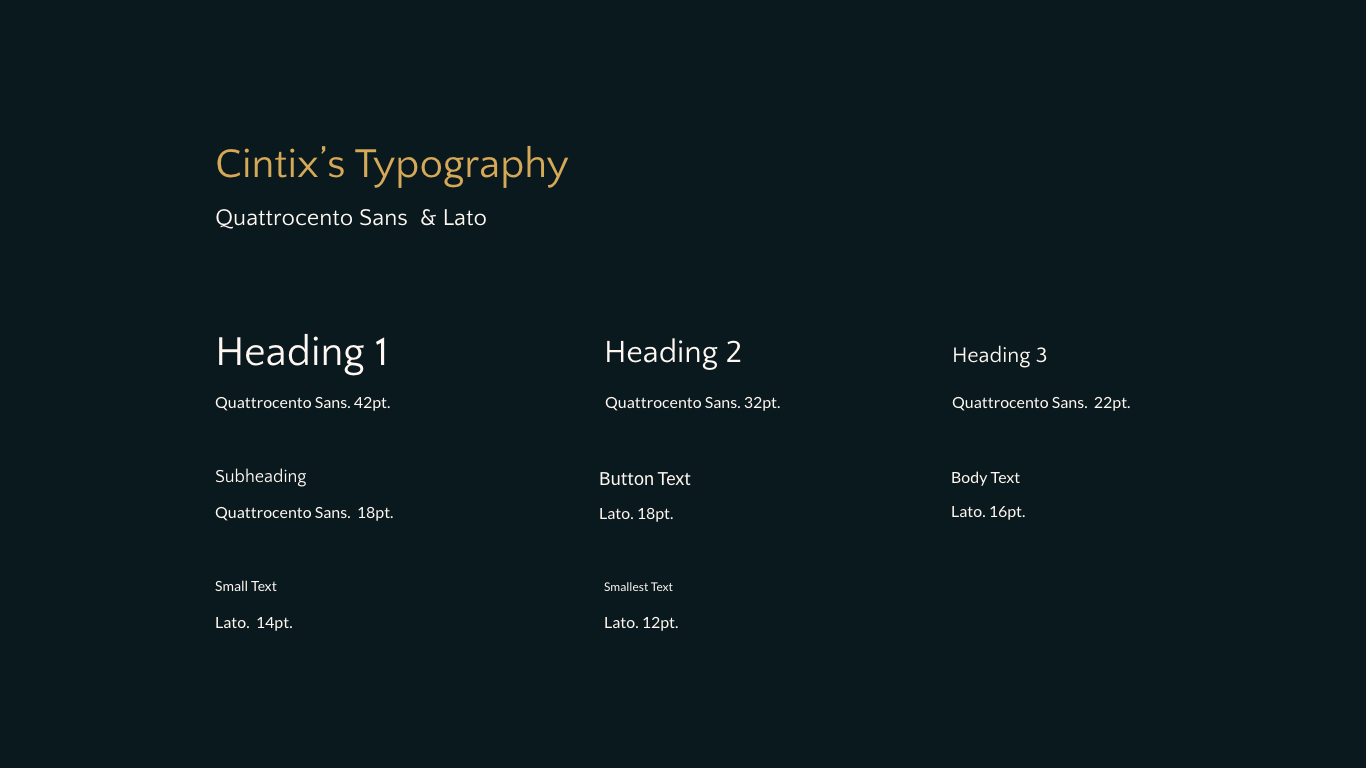
Later, I have researched the look and feel of the UI to make the app easy-to-use and clean looking through a style guide. I chose light brown as my main colour, as it gave off a very casual, welcoming vibe, but kept the typeface and interface as simple as possible.
HIGH FIDELITY PROTOTYPE
After creating the low fidelity prototypes I conducted user testing to see whether any changes needed to be made to the design. Overall, the reception was positive, however a lot of users signalised that the journey is a bit too long with having to search for locations, so I have made an extra step in the beginning of the journey, so that the user is able to choose where they want to go to the cinema.