Peaches
SHOPPING APP / FIGMA
01 / PROBLEMS
ACCESSIBILITY ISSUES AND MORE
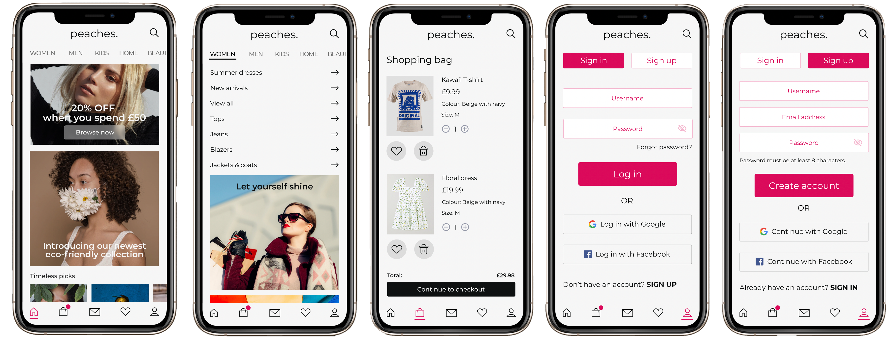
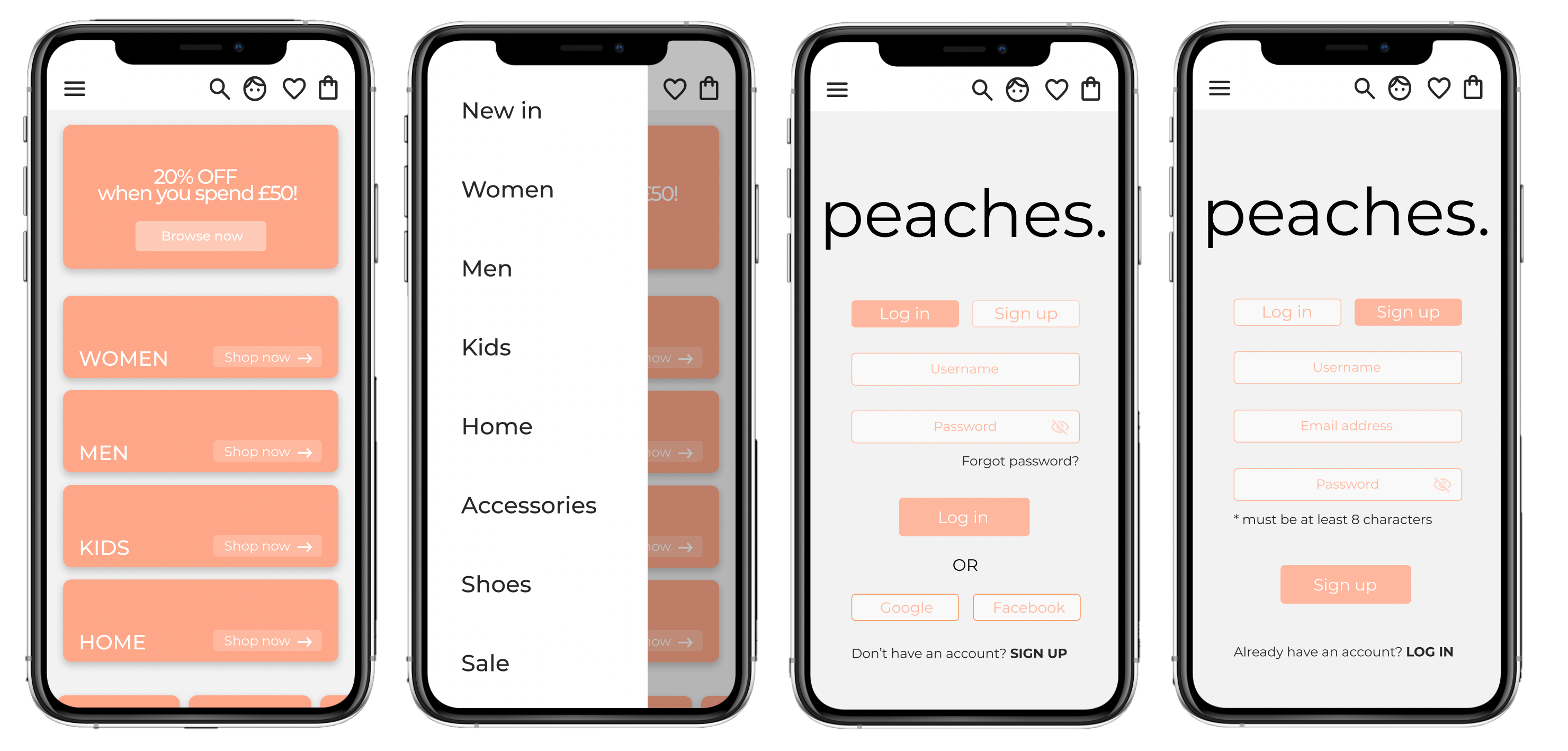
My app, called Peaches, originally had a hamburger menu placed in the top left corner and a main menu on the top right, alike many other apps of the same sort. After using my phone to order clothes in bed (and many phone-falling-on-face incidents), I realised that my thumb does not naturally reach the top of my phone. According to the principles of the thumb zone, our most natural thumb placement lies mostly on the bottom of the screen, which my first design did comply with. The hamburger menu used in my design, also did not perform well. Like in a famous clothing brand’s app, H&M, the problem was that if the menu was active, all the other features of the app and even the icons on the main page were hidden. The only way to go back to the main page was to click away, and then we could easily forget the categories and menu items and the UI appeared very unclear.
Another problem that I discovered while researching clothing apps, as well as my own, was the size of buttons. The padding on clickable icons was so small that it required more precision than an average consumer has the patience for. I also checked my colour scheme in terms of web accessibility in mind and the contract between the “peachy” orange (#FEB79E) and background white was only 1.68:1, which indicated that the colour contract failed in all text sizes, in both WCAG AA and WCAG AAA criterions.
02 / SOLUTIONS
DESIGNING FOR INCLUSIVITY
In my app redesign, I implemented a bottom menu, which is easily accessible from all pages and only left the search button on top, so that it is easy to find. Instead of a hamburger menu, I used horizontal scrolling for categories and added icons, which I made according to the app’s style. The categories are implemented on the first page, along with all the promotions that can catch the user’s attention. I added more padding to the icons, but less stroke, which made the icons easier to click on.
I made important buttons, such as “Log in” and “Create an account” bigger to emphasise their importance and I added clearer options for login using Google and Facebook. My goal was to make creating an account as efficient as possible. I deleted the company logo from the login page and instead used it on all pages to create a cohesive user experience.
I changed the main colours of the app, focusing on the web accessibility index to create a more inclusive design. I picked off-black and off-white to lessen the strain on the users’ eyes and changed the peachy colour to a deeper pink (#DB0A5A), with a contrast ratio of 4.64:1. I also added a shopping basket and made one of the categories interactable, so that the objective of the app could be clear to the user. I also added stock photos to make the design more realistic and appealing to the eye.